Customizing Angular Material with your own palette

Angular Material provides flexibility in making your website look and feel like the brand you are trying to build.
One of these the ways the library achieves this is by adding your own palette instead of the default themes: deep-purple-amber, indigo-pink, purple-green or pink-bluegrey.
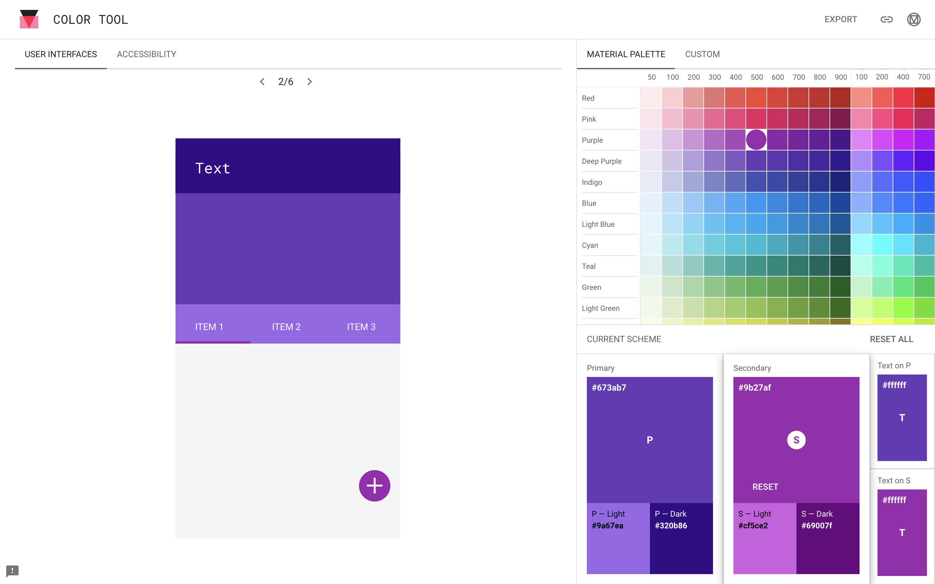
The first thing you'd need to do is select your primary, accent and tertiary colors. The material.io Color Tool provides a useful visual preview of what your primary and accent colors would look like on an application interface.
Here's a sample which you can also preview here:

The tool also shows you how accessible your color palette is against fonts of various colors. With the above palette, for instance, the P-Dark with black text would not be as visible.
Although this tool doesn't provide an option to add a warn color, the angular material documentation makes this palette optional and defaults to red if not specified.
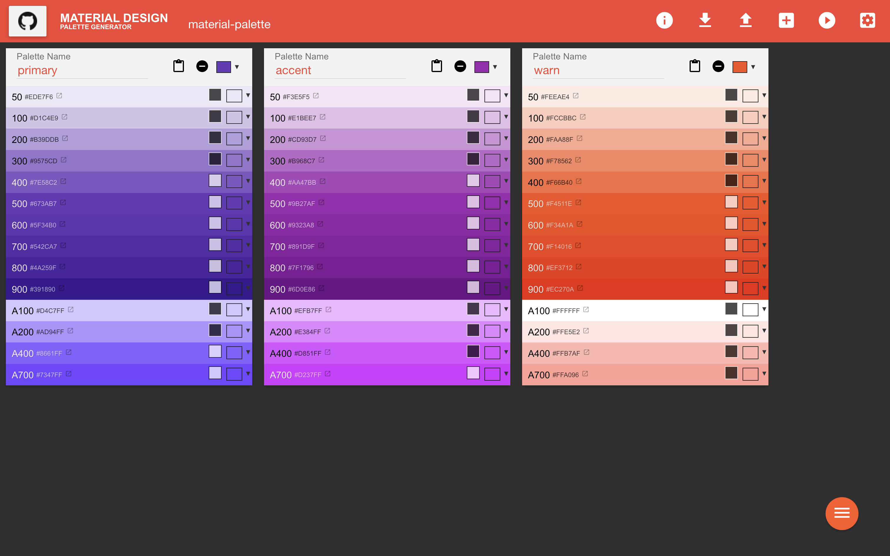
With the palette above: (primary: #673ab7, secondary: #9b27af, and a warn color value of #f4511e), we can use an open source tool called Material Design Palette generator to generate hues of 50 and then each 100 between 100 and 900 without having to do this manually.
Our resulting palette would look like below. You could also play around with the palette here and try out different colors as well.

The cool thing about the tool above is that it provides an easy export function for various frameworks including Android, Angular, React, Vue, Ember and more.
Since we are using Angular, we would use the Angular 2 Material exported values which we can define in a palette.scss file:
/* For use in src/lib/core/theming/_palette.scss */
$primary: (
50: #ede7f6,
100: #d1c4e9,
200: #b39ddb,
300: #9575cd,
400: #7e58c2,
500: #673ab7,
600: #5f34b0,
700: #542ca7,
800: #4a259f,
900: #391890,
A100: #d4c7ff,
A200: #ad94ff,
A400: #8661ff,
A700: #7347ff,
contrast: (
50: #000000,
100: #000000,
200: #000000,
300: #000000,
400: #ffffff,
500: #ffffff,
600: #ffffff,
700: #ffffff,
800: #ffffff,
900: #ffffff,
A100: #000000,
A200: #000000,
A400: #ffffff,
A700: #ffffff,
),
);
$accent: (
50: #f3e5f5,
100: #e1bee7,
200: #cd93d7,
300: #b968c7,
400: #aa47bb,
500: #9b27af,
600: #9323a8,
700: #891d9f,
800: #7f1796,
900: #6d0e86,
A100: #efb7ff,
A200: #e384ff,
A400: #d851ff,
A700: #d237ff,
contrast: (
50: #000000,
100: #000000,
200: #000000,
300: #000000,
400: #ffffff,
500: #ffffff,
600: #ffffff,
700: #ffffff,
800: #ffffff,
900: #ffffff,
A100: #000000,
A200: #000000,
A400: #000000,
A700: #ffffff,
),
);
$warn: (
50: #feeae4,
100: #fccbbc,
200: #faa88f,
300: #f78562,
400: #f66b40,
500: #f4511e,
600: #f34a1a,
700: #f14016,
800: #ef3712,
900: #ec270a,
A100: #ffffff,
A200: #ffe5e2,
A400: #ffb7af,
A700: #ffa096,
contrast: (
50: #000000,
100: #000000,
200: #000000,
300: #000000,
400: #000000,
500: #ffffff,
600: #ffffff,
700: #ffffff,
800: #ffffff,
900: #ffffff,
A100: #000000,
A200: #000000,
A400: #000000,
A700: #000000,
),
);In our theme.scss file, we would then define our palette as below:
@use './palette.scss' as palette;
@use '@angular/material' as mat;
@import '@angular/material/theming';
$app-primary: mat.define-palette(palette.$primary);
$app-accent: mat.define-palette(palette.$accent);
$app-warn: mat.define-palette(palette.$warn);
$app-theme: mat.define-light-theme(
(
color: (
primary: $app-primary,
accent: $app-accent,
warn: $app-warn,
),
)
);
@include mat.all-component-themes($app-theme);And just like that, we have customized our Angular App using Angular Material and a custom theme.